
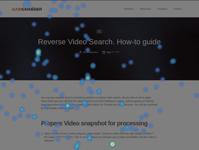
Heat maps are a great way to know about your users’ activity on your website pages. Read more to find about heat maps and how to set one up in Google analytics heat mapping.
What is a heat map?
Heat maps are a way to analyse in detail what your users are doing on your website pages. Such examples of activities include the things they disregard, what items interest them, and how far along they scroll your page.
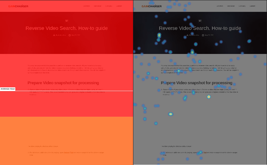
In detail, a heat map is a graphical visualisation of data. The values are represented by colour. Heat maps are used to better understand complex data. In the case of heat maps for websites, the most popular elements of the webpage are shown as hot (red), while the least popular are shown in colder colors, the coldest being (blue).
How Google Analytics heat mapping works
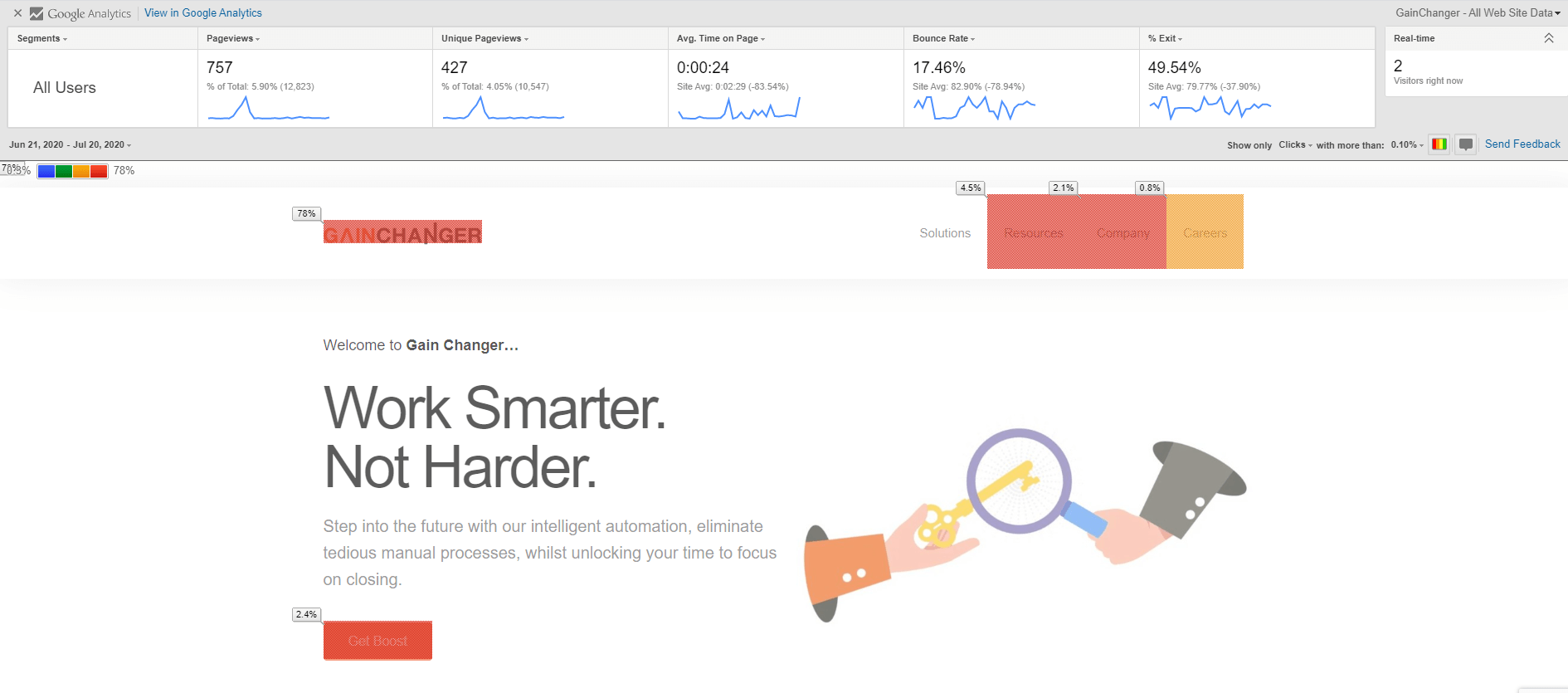
Google Analytics is the most popular data tracker for websites. But the data alone, may not be sufficient enough to understand visually what is happening on your webpages. With the help of a chrome extension called Page Analytics, the data from Google Analytics can be mapped in a heat map. Google Analytics heat mapping will show you visually which pages your users are interacting most.
How to set up a Heat map with Google Analytics
It is very easy to set up and can be done in quickly. Here are the steps that you need to take:
- Firstly, you need to sign up for Google Analytics account and alter your website code with their standard rules. This needs to be put on each web page you want Google Analytics to track.
- Next, download the Chrome extension called Page Analytics. Google Analytics will expose all the data that will be shown in the heat map.
- You are now set to analyze each web page. After download extension, each web page should be provided with a click map.
- Following that, you will see an icon in the top right corner of your website. Turn it on.
- The heatmap will show you the most clicked linked percentages. You can choose to show colours and your data percentage will change to different shades of colours. Red, being the most visited, and blue the least.
You can also create your own custom report with custom metrics in heat maps in order to reap the most benefits. Here are more details on this here.
Types of heat maps
There are a number of heat maps. We will be looking at the most prominent in detail:
Scroll maps
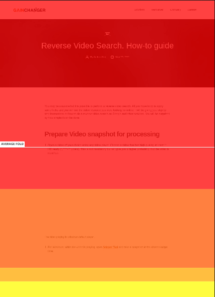
Scroll maps describe the exact percentage of users scroll activity. The redder the area, the more users have seen that area of your page.
Click pages
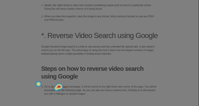
As the name suggests, click maps show you an aggregate of where users click on desktop devices. For mobile or touch-support devices, the map is called touch heat maps. The map is colour-coded and indicates which elements in the page where clicked the most. With the red being the highest. In the example above, ‘Try it free’ was not clicked as often as Hotjar would have liked. In other cases, the header buttons were more popular. Note how clicks are recorded even if the element is not clickable.
Move maps
Move map represents where users spend most of their time as they navigate with their mouse. It measures where users move and pause their mouse in the page. The red spots depict where the users have paused their mouse movement. Research has shown that there is a direct correlation of where people are looking and their mouse position. Therefore, Move maps give you a good indication of where the user might be looking as they navigate your page.
Device heatmaps

Device heatmaps show how you perform in desktop PCs versus mobile devices. This can help you understand how you should outline your content in different devices.
Benefits of using a heat map
Heatmaps can help you understand how your users are interacting with your websites. It can help find major issues which cause users to disregard important content or distract users from other important elements.
So if you are still not convinced, here are 4 reasons why heatmaps can help your users convert in your business:
1. Instant overview of web performance issues
Firstly, heat maps can instantly show you which areas of your web pages are suffering. As mentioned above, the attributes shown for each of the heat maps aggregated together will indicate the main issues. On the other hand, cold areas that do not get much attention should be re-evaluated and folds in the scroll heatmaps can quickly indicate disinterest in users. Geo heatmaps will give you an idea which locations give you better conversion. This helps know which areas to focus on.
2. Visualization to numeric values
I think mouseflow.com describes this best:
If a picture is worth a thousand words, a single heatmap can be worth a thousand numbers.
Spreadsheet numbers will give you detailed information such as click-through rates (CTR) or pages with higher bounce rates. However, heatmaps show you exactly where the problems reside. For example, a heat map can quickly expose that your low CTR is due to a link being hidden under other distracting elements.
3. Easier to learn from users
Surveys and forms have their benefits, but nothing beats actual proof of the user activity. Heat maps that show the navigational pattern of the users is evidence of direct and unfiltered feedback. You can also test future design decisions with heat maps without deploying them to a wider audience.
4. Learn the frustrations and interests of users
Lastly, heat maps provide friction scores which track data points and heuristics where users experience frustration, what entices them, and what does not.
Final thoughts and Recommendations
Heat maps provide visualisation of the numerical data provided by data analytic tools. Having the benefit of seeing the mappings directly on your web page, helps you know exactly which important elements are being neglected. It also helps you understand which areas you should focus on more. In the end, heat maps will make you take more informed and data-based decisions for designing your website.